How do you decorate with pink furniture without making your home feel childish?
Pink furniture gets people nervous. That's the honest starting point.
Not because the colour is actually difficult to use, but because most of us have a fixed mental image of what pink furniture looks like. Bubblegum. Gloss. A little girl's bedroom.
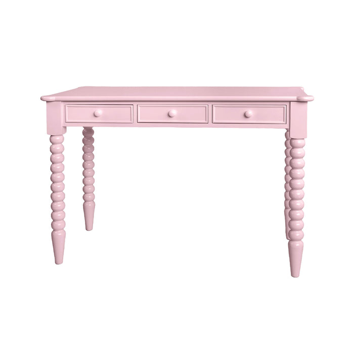
The right pink is dusty, earthy and warm rather than sweet. It reads as a neutral in low light and a statement in the right room. Used well, it sits happily alongside almost any decor.
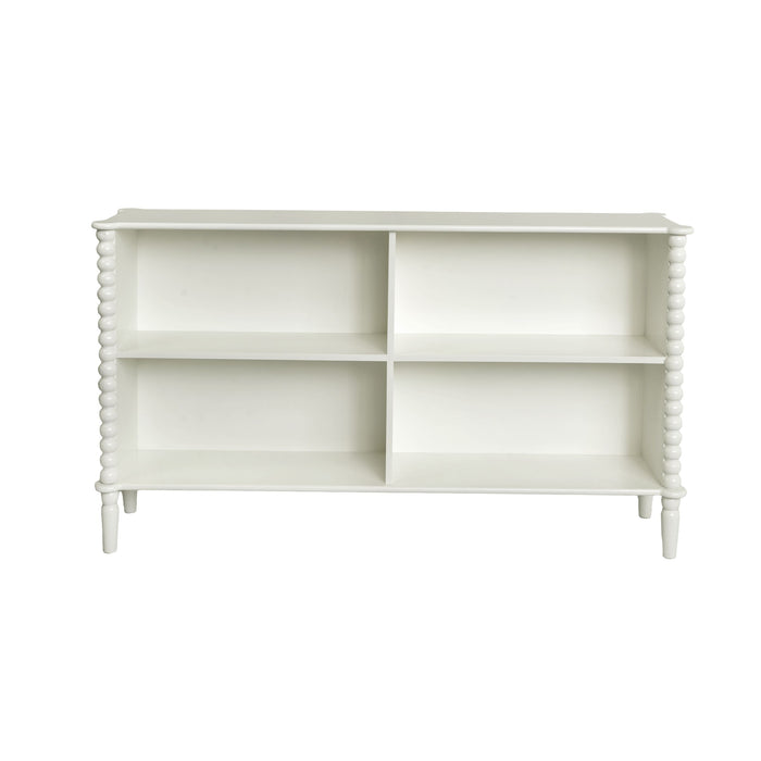
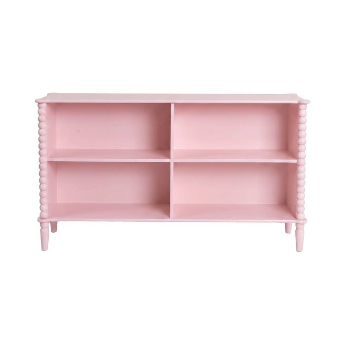
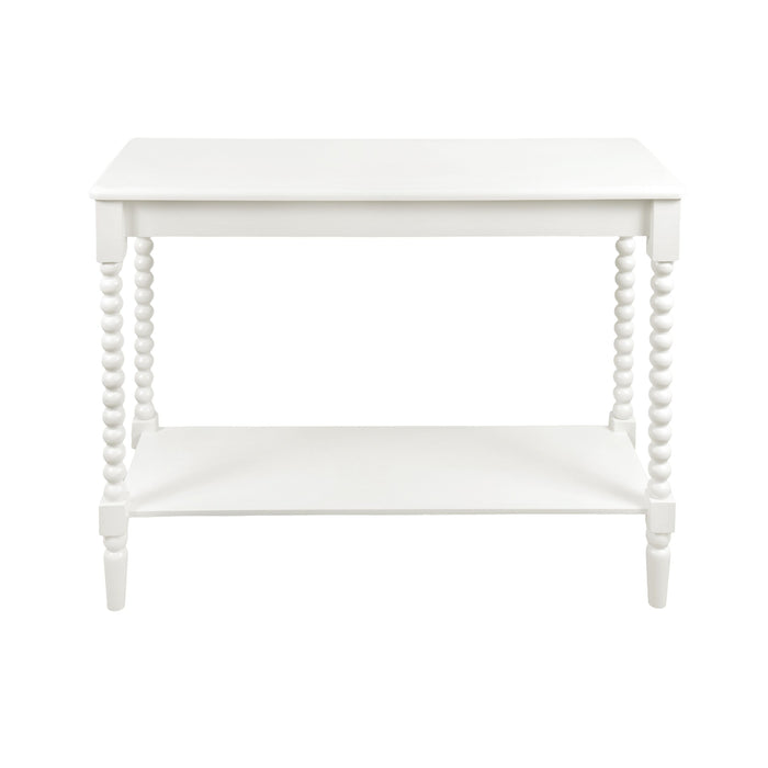
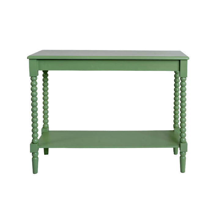
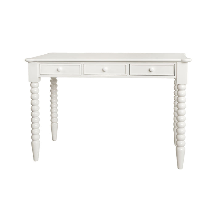
The Maisie collection is one of the clearest examples of how this works in practice. Solid construction, bobbin-detailed frames available in dusty pink, crisp white and dusty sage green, and a range that moves through the whole house: bedside tables, desks, consoles, bookcases. Pink furniture can absolutely look sophisticated in your home. The trick is knowing how to use it.
Why is pink coming back in interior design?
Simple beige interiors had a long run.
What shifted was more gradual than a single trend. People started spending more time at home and realised they wanted rooms that felt like something. Collected living became the phrase for it. Less showroom, more inhabited. More personality, less performance.
Into that shift, colour came back. Not as a statement wall or an accent, but as a considered choice in the actual furniture. Dusty pinks, sage greens, warm ochres. Shades that have enough grey or earth in them to feel settled rather than shouty.
The reason muted pinks hold up is the same reason terracotta or warm sage holds up: the colour doesn't compete with natural light, it responds to it. In morning sun it's warm. In flat afternoon light it's calm. It doesn't fight the room. And because it's subtle, it ages well. The pinks that look dated are the ones that were always too sweet to begin with.
Colour is increasingly being treated as an investment, not a risk. A well-chosen coloured piece can carry more character than five new cushions ever will.
How do you choose the right shade of pink?
This is where most people go wrong, and it's worth spending a moment on. Pink isn't a single colour. The gap between a dusty mauve-pink and a bright coral is enormous in terms of how each reads in a room.
The shades that work best in adult spaces share a common quality: they have something else in them. A little grey, a little brown, a little terracotta. That undertone is what stops the colour from reading as sweet and pushes it toward warm and grounded.
Dusty pink is the most versatile. It softens in natural light, goes darker toward dusk, and pairs with almost anything in the neutral-to-warm spectrum. Warm earthy pinks sit closer to clay and terracotta, stronger but still liveable. Soft blush is lighter and more bedroom-friendly. Bubblegum and hot pink are the ones to avoid unless you're making a very deliberate and committed statement.
The Maisie collection sits in the dusty-to-warm range, which is why it reads so differently from what most people picture when they think "pink furniture."
What colours go with pink furniture?
You don't need to overhaul a room to make pink furniture work. Most of the combinations that land well are ones you're probably already halfway there with.
Pink and natural timber
This is the most reliable pairing. Blonde timber, raw oak, anything with warmth in the grain, sits next to dusty pink without any tension. The two colours share the same earthy base. The result is warm and considered rather than sweet.
Pink and white
Simple, fresh, and very easy to get right. White walls give the pink room to breathe and stop the colour from feeling heavy. Works particularly well in bedrooms where the goal is calm rather than contrast.
One of the strongest interior pairings of the moment, and one that surprises people every time. Green has enough brown in it to ground the pink rather than compete with it.
Together they feel organic, earthy, and genuinely stylish. A Maisie pink bookcase in a study with sage green accents is a room that earns its own Instagram photo.
Worth knowing: Maisie also comes in dusty sage green, so you can run the pairing the other way, a green piece with pink accents, or mix both finishes across the same room for a collected, layered feel.
Pink and charcoal or black
This is the combination that most convincingly answers the question of whether pink can look grown-up. Dark charcoal walls or black accents against a dusty pink piece creates contrast and sophistication. The pink stops the dark from feeling cold. The dark stops the pink from feeling soft. It works particularly well in a home office or a living room used for evening entertaining.
Pink and soft neutrals
Linen, oatmeal, warm greige. The most liveable version. Nothing clashes, everything layers, and the pink becomes the warmest thing in a room that otherwise reads as calm. This is the version that works in every room of the house and doesn't require confidence to pull off.
Pink and brass
Brass hardware or brass lighting against a dusty pink piece looks expensive without effort. The two tones share warmth. Use sparingly, because too much brass tips into maximalist territory, but a single pendant or a few handles will do more than you expect.
Start with one piece and build from there
The instinct when you're nervous about colour is to do very little of it. Which sometimes produces timid results. A pink cushion on a white sofa in a white room doesn't tell you much about whether you like pink furniture. It tells you that you're not ready to commit.
The more useful move is to start with one piece that actually has presence. A bedside table or a desk. A console in the hallway. A bookcase in a reading corner. Something that functions properly and also happens to be the most interesting thing in the room.
From there, the room does most of the work. Bring in textures that you already love. Keep the rest of the palette quiet. Let the pink piece be the point.
A Maisie bedside table in a room that's otherwise timber, linen and white doesn't need anything else to justify its presence. It just needs the room to stay out of its way.
One good coloured piece is also far easier to live with long-term than a fully themed room. It moves. It carries to the next apartment or the next room. It doesn't require everything around it to change when you do.
How do you use pink furniture in every room?
Bedroom
The bedroom is where dusty pink is most at home, and also where people default most quickly to the children's room interpretation. The difference is everything that surrounds it.
Natural linen bedding, timber frames, rattan or jute accents. Lighting that's warm rather than bright. Artwork with weight to it. A Maisie bedside table in this kind of room reads as a considered choice, not a leftover from a nursery phase. Add a matching desk in the corner and the collection starts to feel intentional rather than incidental.
This room works best in dusty pink with warm white, natural timber and olive or sage as a grounding accent.
This is the room where pink furniture is most underused and most effective. The logic is simple: a home office that looks like a home office is a missed opportunity. Most of them are beige, neutral, forgettable.
A Maisie desk changes the room. Immediately. It makes sitting at it feel like something you chose rather than something you settled for. Pair it with a desk chair in natural linen or aged leather, a tall bookcase behind you, and a pendant overhead instead of harsh ceiling light. The room becomes a space you actually want to be in.
If pink feels like too much of a commitment for a workspace, the Maisie white or sage green finishes give you the same bobbin detailing and construction in a quieter tone. The room still gets character. Just a different conversation.
Dusty pink alongside charcoal, dark timber, aged leather and brass is the palette that works hardest in a home office.
Living room
Pink furniture works best in the living room as an accent rather than the anchor. A Maisie console or low bookcase against a wall of neutrals gives the room personality without overwhelming the space. Style it with books, plants, a few pieces of collected homewares and leave it at that.
Occasional chairs in a complementary dusty tone work here too. The key is restraint. One or two pieces with purpose.
Entryway
A Maisie console in the entry tells guests something about the house before they've seen the rest of it. The entryway is a small room with low stakes and high impact. A coloured piece, a mirror, a pendant, one plant. That's actually all it needs.
Reading nook
Small spaces are where colour can work harder. A tight reading corner with a Maisie bookcase, soft lighting and layered textiles becomes the most inviting corner of the house. The pink reads cosier at small scale. It draws you in rather than asking you to look at it.
Guest bedroom
Guest rooms often have the lowest design investment in the house, which is a shame given that they're rooms people actually sleep in and remember. A Maisie bedside or a small desk changes the room from a spare space to something that feels genuinely considered. Natural bedding, a warm lamp, a rug. Done.
Why bobbin furniture looks the way it does
Bobbin detailing has a history that goes back centuries. The turned spindle form, a series of rounded segments along a leg or frame, was common in 17th century European furniture, particularly in English and Dutch pieces. It fell in and out of fashion for a few hundred years before resurfacing in contemporary interiors, where it adds handcrafted texture to simple silhouettes.
What makes it relevant now is the same thing that made it relevant then: it gives a piece of furniture a presence that flat surfaces can't achieve. You notice it differently in different light. The shadows change through the day. It's inherently less sterile than a straight leg or a plain rail.
Paired with a dusty pink finish, the bobbin form softens further. The combination of colour and texture reads as something between traditional and contemporary. It's not vintage pastiche. It doesn't need to be explained. It just looks like it was made with attention.
Five styling principles worth actually following
Design rules are worth knowing so you know when to break them. These five are the ones that hold up most consistently when decorating around a pink furniture piece.
-
Repeat your accent colour at least three times in the same room. One pink piece sits alone. A second point of pink, even small, such as a book cover, a plant pot, a piece of artwork, starts a conversation. A third anchors it.
-
Balance colour with natural textures. Jute, linen, rattan, raw timber. These materials stop a coloured piece from feeling precious by surrounding it with things that are clearly working-life objects.
-
Layer different materials rather than matching everything. A pink bookcase with wicker baskets, leather-bound books and ceramic objects looks considered. A pink bookcase with pink accessories looks like a brand activation.
-
Introduce greenery as contrast. Plants and pink furniture are a natural pairing, partly because green is the direct complement of red in the colour wheel and partly because it's a colour that never feels forced. The more wild and textural the plant, the better.
-
Leave neutral space. Not every surface needs something on it. The room around a pink piece should have enough breathing room that the colour remains the focal point rather than one note in a crowded composition.
How the Maisie collection grows with a space over time
One of the most useful things about a well-designed furniture range is that it's not locked to one room or one stage of life. The Maisie collection moves from a nursery to a child's room to a teenage study to a first apartment to a properly considered adult home, and it looks right in all of them.
That's not an accident. It's because the bobbin form is traditional enough to feel timeless and the finishes are considered enough to flex with different palettes. The dusty pink is warm and characterful. The white is clean and versatile. The dusty sage green brings an earthy, organic quality that pairs just as well with timber and linen as the pink does.
All three can be used on their own or mixed across the same room. A pink bedside with a white bookcase. A sage green desk alongside a white console. The pieces share the same silhouette and detailing, so mixing finishes reads as collected rather than mismatched.
A Maisie tall bookcase bought for a reading nook becomes a study bookcase. A bedside table carries from one bedroom to the next. A desk that started in a home office becomes the focal point of a guest bedroom. The pieces don't age out.
What changes is what surrounds them. The room grows, the palette shifts, the accessories evolve. The furniture stays.
Shop the Maisie collection
The Maisie range is available in dusty pink, white and dusty sage green across bedside tables, desks, consoles, bookcases and more. Each piece is sold individually so you can start with one and build from there, or put together a whole room if you already know what you want.
Shop the Maisie Collection at Early Settler. Available in dusty pink, white and dusty sage green. Shop Maisie
If you'd like styling advice before you buy, our team is available in-store across Australia and New Zealand, or you can browse the full range online and use the room inspiration imagery to see how each piece sits in a real space.